
Graphs and visualisations in Matomo
The main reporting area within Matomo is where you’ll review your data from the various sections of the main navigation. Analytics data within the Matomo reporting interface is displayed through four primary visualisations. These are the Evolution Graph, Table, Sparkline Summary Cards and Maps. Each of these is described in more detail below.
Evolution Graphs
The Evolution Graph visualisation shows a customisable line graph over the specified time period. You can change the period via the Date Selector in the data selector area. Each chart will typically load one metric by default. You can usually customise this chart by plotting different metrics. You can also display the numeric values for any metric by hovering your mouse over its point on the chart.

Changing Plotted Metrics
To change the plotted metrics within any Evolution Graph, click the Choose metrics dropdown. This will bring up a list of all metrics which are available for this visualisation. Select the metrics to include in the graph and the page will refresh with your updated data.

Evolution Graph Menu
Use the green icons to access additional reporting features:

- Calendar Icon
 – This lets you update the graph to display your data in days, weeks, months, or years.
 - Share Icon
 – This allows you to export the data into various formats so you can work with it in other software.
 - Image Icon
 – Clicking this loads your data as an image which can be helpful for compiling reports for clients or management. You will still have to right-click and Save the file to download it to your device.
 - Annotation Icon
 – This annotation feature is extremely useful as it can help to provide context to changes in your data. Check out the documentation to learn more about how to use annotations. Within the Evolution Graph section, it will bring up a list of annotations within the selected date range and a button if you want to add your own.
Tables
Tables are another data visualisation format that is very useful for reviewing your data and you can switch between flat or hierarchical reports. Tables typically show a primary dimension such as a page or traffic source on the left, followed by a series of associated metrics in columns on the right. Hover your mouse over rows and metrics to reveal additional data and features.
Switching between hierarchical and flat reports
The flat report lists each page on its own row using the full page path.

The hierarchical report groups pages according to the website’s URL structure. Metrics for sub-pages roll up into their parent pages, making it easier to explore large websites by section.
In the hierarchical view, click the plus (+) icon to expand a section and view its sub-pages. Click the minus (–) icon to collapse the rows.

In the example report above, expanding my-account displays sub-pages such as /my-account/orders/. A page named index represents the default page within that directory. In this case, /my-account/ and /my-account/index refer to the same page. The metrics shown for a parent page equal the combined totals of its sub-pages. See How to group homepage URLs.
To switch views, click the cog icon  , and select Make it flat or Make it hierarchical. The available option depends on the view currently displayed.
Show Table Totals
Click the cog icon and select Show totals row. This includes the total of all rows in the report.
When you filter table reports like the Behaviour > Pages report, the Totals row does not update based on the filtered results.
Show Absolute values or Percentages
Click the cog icon and choose whether report values are shown as Absolute values or Percentages by default. When Absolute values are selected, you can hover over a value to view its percentage, and vice versa.

Revealing extended Table data options
Tables within Matomo will load all available data for the most common metrics. However, many reports provide options to customise the data shown in the table. To explore the available options for a table report, click the green cog icon . The specific options will vary between reports.
Learn how to show/hide aggregate rows in report views.
Searching within reports
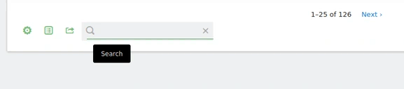
You will also notice a search icon above and below most tables. Clicking this will reveal a search bar. You can then type in the data you are looking for and hit the Enter or click on the Search icon again to search. For example, in the “Keywords” report, you can search for nature and it would return all keywords matching nature. Learn more.
Viewing historical report about any data point
You can expand the data within any row in the tables to show a historical Row Evolution. To do this, hover the mouse over a row and click on the row evolution icon  which will open a detailed view of the historical values for this specific row:

You can also compare several rows together, for example to compare Browser market share over the last 30 months. To do this click on the link to Pick a row to compare and then click the row evolution icon on the additional row you like to compare to load the comparison.

Changing number of rows displayed in the report tables
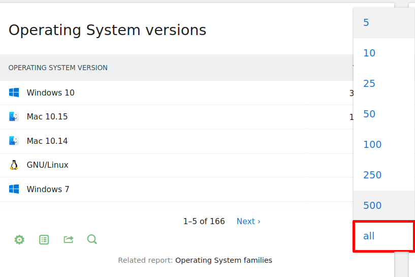
Tables containing a large number of rows are separated across multiple pages that you can navigate with the < Previous and Next > links shown below the table. The current number of rows per page will be displayed in green at the bottom right of the report when you hover the mouse over the table. You can change the number of rows displayed by clicking on the number and selecting an alternative. For example in the Operating System versions table below you can see the option to display 5, 10, 25, 50, 100, 250, 500 rows, or all rows without any limit applied.
Alternative Visualisations of Table Data
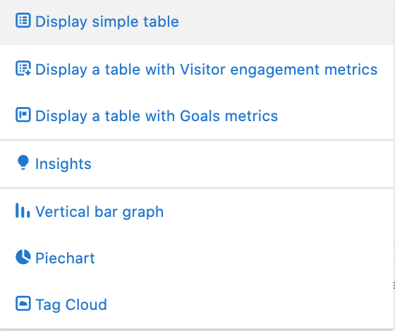
There are also several types of graphs you can use to display table data which you may find useful. The icon shown for accessing these will vary depending on your current visualisation. By default you will start in the table view, so you would click the green table icon  at the bottom left of the table to bring up the visualisation menu shown below.
Insights
Within the Insights visualisation, you can quickly reference the biggest increasing and decreasing metrics of your current report. This is also known as the Movers and Shakers report. Below the report you will be able to choose from a number of comparison periods depending on what makes sense for each specific report, including:
- Previous day
- Same day in previous week
- Same day in previous year
- Previous week
- Previous month
- Same month in previous year
- Previous year
- Previous number of days (Compared to a custom date range)
You can also see the results for a different time period by changing the date in the Date Selector at the top of the page. The data can also be filtered for example show only movers, only the new elements, or only show those that have disappeared from the report. By default, the report is set to show Increaser and decreaser, or you can update it to show either on its own.
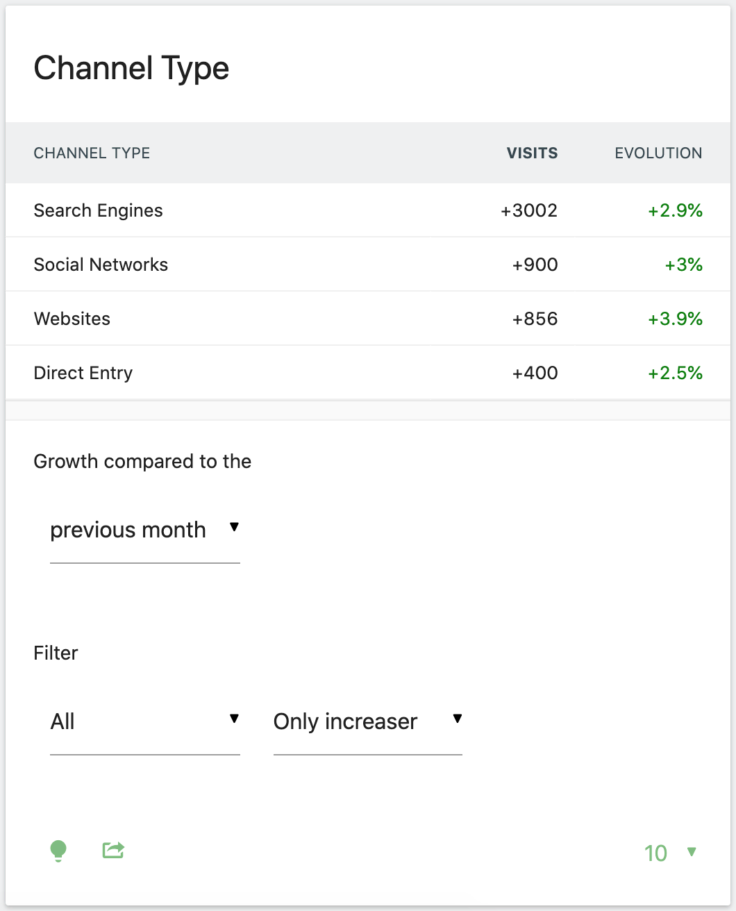
The example below shows the most increased visits by Channel Type over a one-month period. You can see the actual number of additional visits and the percentage increase those visits represent.
Graphs
The Vertical bar graph visualisation is useful for a visual comparison of the numeric data values. Whereas, the Pie charts visualisation can easily show you the relative distribution of each item from the table.
Lastly the Tag cloud is great for generating a visual snapshot of your most populous data. Higher value items are shown in bold with an increased font size. The example report below shows how you might use this to identify your top search keywords.

Sparkline Summary Cards
These are most commonly shown on overview pages and provide a high-level summary of the data surrounding a topic. For example, on the Goals page, you will see a summary of the number of conversions, the conversion rate, and overall revenue associated with these goal completions.

Sparkline summary cards are shown with a line chart on the left and a text summary of the data just to the right of it. The line chart spans the date period you have selected with the Date Selector. Within this line chart, the red bubble represents the lowest data point, the green represents the highest data point, and there is a blue bubble at the end, representing your most recent data point.
There are no settings within these summary cards however, there are two significant features. You can hover over the percent indicator for a more detailed description of the data shown. Clicking on a sparkline will update the Evolution graph to display its data.
Maps
The final data visualisation is the Map view which is only relevant when looking at location-based data. By default, this shows a world map. You can drill down, by clicking on a country to see a breakdown of regions, and you can click on these to reveal an Evolution Graph for the selected region. It is important to remember when you are reviewing location data, that this is being pulled from the IP address. This means the accuracy may vary depending on how you have configured your privacy settings.
Learn more in the guide Visitors maps (World, country and region)