Where to find Row Evolution graphs
There are two main types of evolution graphs within Matomo. The first are standard Evolution Graphs which you will commonly find at the top level of sections such as Visitors Overview or the Acquisition Overview accessed through the main navigation menu. These display high-level trend lines for the current reporting section. You’ll also see these prominent evolution graphs on the Goals and Ecommerce sections if you have enabled either of these features within Matomo.
Access Row Evolution Graphs within your report data
While the sections discussed above contain evolution graphs by default, it is also often possible to review a Row Evolution Graph for specific rows of data within any table report. You can tell if a report is available as a table if the following icon is present:
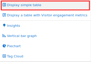
Clicking that icon will show the report as a table.
To show the evolution of a single row, find the row of data you are interested in analysing and hover your mouse over it to reveal several green icons as seen below.

You can then click on the row evolution icon ![]() to load a row evolution graph in a popup, where you will be able to see how the metrics for that specific row have evolved over time.
to load a row evolution graph in a popup, where you will be able to see how the metrics for that specific row have evolved over time.

Access Row Evolution Graphs from Sparkline Summaries
In sections such as the Visitors Overview, where there is a sparkline summary card below the evolution graph, you can typically click on any of the metrics within that summary card to reload the evolution graph at the top of the page to display the selected metric(s). An example can be seen in the screenshot below, where clicking on the download count sparkline summary in the Visits Overview box has loaded the Downloads and Unique Downloads metrics into the evolution graph at the top of the page.
