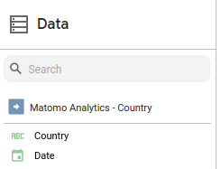
Once you configure the Matomo Connector for Looker Studio, you can use Matomo data to create time series charts. Every data source created with the Matomo connector will automatically have a Date dimension:

A screenshot of the Looker Studio data pane with the details for a data source named "Matomo Analytics - Country" expanded. Only two dimensions are shown in the screenshot, Country and Date.

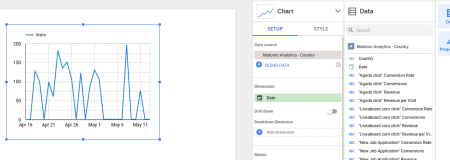
This dimension can be used to provide per-day metrics based on the date range you have selected in Looker Studio.

So if you drag the Date dimension onto your Looker Studio report, Looker Studio will automatically add a time series chart. For example:

A screenshot of a time series visualization in Looker Studio that's using data from the Matomo Countries report. It displays the Visit count for days between April 16 2023 and May 11 2023. The chart properties pane and the Data pane are both open on the right hand side. In the Chart properties pane, the Date dimension is selected as the dimension for the chart.

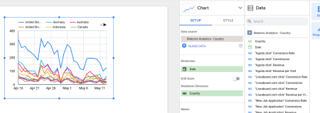
You can drag more metrics and dimensions onto the time series to chart more data. If we add the Country as the Breakdown Dimension, we’ll see:

A screenshot of a time series in Looker  Studio using the data from the Matomo Countries report. In contrast to the previous screenshot, there are more than 6 separate serieses plotted in the graph, one for each country in the report. Each  series displays visits for days within April 16 and May 11, 2023. The chart properties pane is open showing the Date dimension selected as the dimension, and  the Country dimension selected as the Breakdown dimension.

Here’s an example of viewing the conversions and conversion rate of a specific goal over time:

Another screenshot of a time series in Looker Studio, this time plotting the Conversions and Conversion Rate of a specific goal for the days of April 16th to May 11th, 2023. The chart properties pane is open as well with the Date dimension selected for the chart's dimension,  and with two metrics selected: Conversions and Conversion Rate.

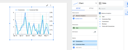
You can create a time series like the one shown above by configuring a data source with the metrics report for the goal. The report should have a name like Goals > Goal Name. Be sure to use the right axis for the conversion rate metric after you add it.

Previous FAQ: How do I apply a Matomo segment in Looker Studio?